

When it comes to evaluating and presenting business data in a meaningful way, many organizations struggle with too much data and/or the speed with which they are bombarded with data every single day. Consequently, the time to present relevant insights for decision makers is often too sluggish, resulting in missed opportunities.
This article highlights some exciting AI features that are readily available within Microsoft Power BI. They are easy-to-use, self-service capabilities designed to empower end users, business analysts, and data scientists with valuable insights.
Key influencers
Key influencer charts are a visualization type in Power BI driven by Microsoft’s artificial intelligence that allows you to quickly see what elements or key drivers influence every metric (measure) you have.
For example, suppose you want to figure out what factors influence the Regular Sales metric in a sample data set for a few retail stores. You have several factors to choose from, such as Retail Chain, Category, Territory, etc. Your task is to identify the top factors that correlate with either an increase or a decrease in the Regular Sales metric.
Here is how the key influencer visual in Power BI looks like for this data set:
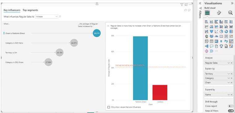 We can infer the following from this visual. The Regular Sales metric increases the most (by 60.27K) when Chain is Fashions Direct. The other three top factors that cause Regular Sales to increase are Category (020-Mens), Territory (OH) and Category (050-Shoes). By selecting each of these factors in the left pane of the Key influencers tab, you can assess them individually in the right pane (column chart).
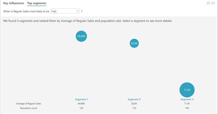
You also can use the "top segments" tab to see how a combination of factors affects a given metric. Top segments shows a combination of factors (segments) that affect the metric you're analyzing.
Here is a summarized view of the data when Regular Sales is more likely to increase:
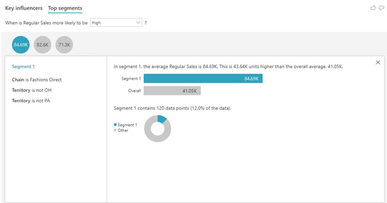
You can further drill down into each of the segments and examine the data as in the screenshot below.
Decomposition tree
The decomposition tree visual allows you to perform exploratory analysis by successively breaking down a measure across multiple dimensions. Building different visuals to summarize data along multiple dimensions can be both time-consuming and inefficient. With decomposition tree, you can automatically aggregate the data and drill down into your multiple dimensions in one report.
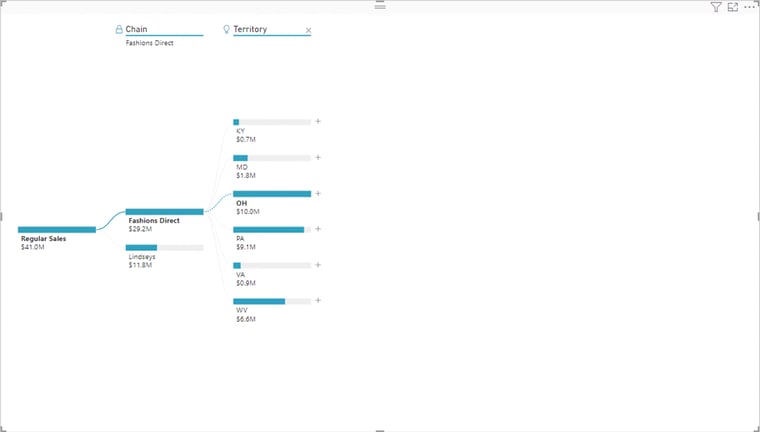
Let us take the example of the sample retail data where you are analyzing Regular Sales. You can add the dimensions such as Chain, Territory, and Fiscal Month to the "explain by" bucket under the visualizations pane. You can then choose which field or dimension you would like to drill into and in any order you want by clicking the plus sign (+) next to it on the left pane.
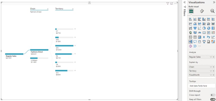
You can also answer questions like “which Territory gives you the highest or lowest value of Regular Sales for a Chain?” using the decomposition tree visual.
These options are called “AI splits” and are marked with a light bulb. The splits are there to help you find high and low values in the data automatically. The visual below shows the path to the “highest” value of the measure being analyzed, which is Regular Sales.
Anomaly detection
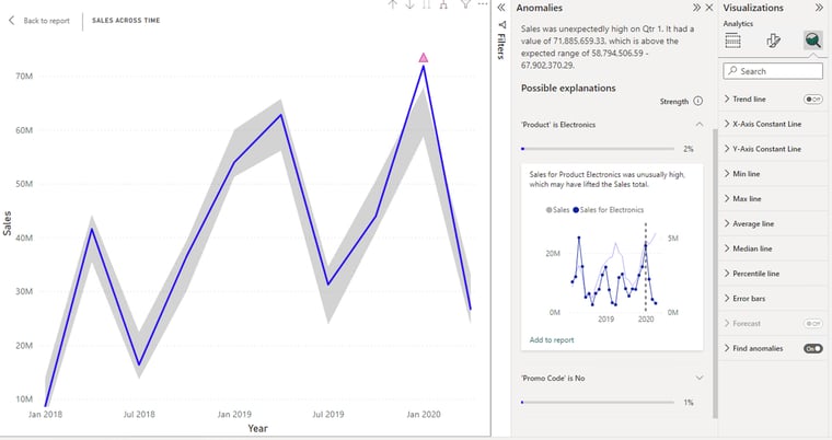
Anomaly detection in Microsoft Power BI enables report creators to enhance line charts by automatically detecting anomalies in time-series data, which is data that changes over time or for which time is considered a variable in the results. Anomaly detection is only supported for line chart visuals containing time-series data. You can access this feature from the Analytics tab under Visualizations.
In addition to detecting anomalies, you can automatically offer possible explanations for the anomalies in the data. When you select the anomaly, Power BI runs an analysis across fields in your data model to figure out possible explanations. It gives you a natural language explanation of the anomaly, as well as factors associated with it, sorted by its explanatory strength.
In the following visual the anomaly is indicated by the triangle in pink.
Smart narrative
Smart narrative allows you to do storytelling in Power BI by adding a textual narrative to your report visuals to help provide additional information to the user.
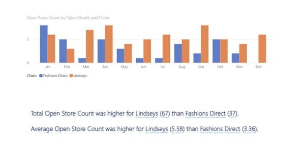
You can create narratives that deliver key takeaways and trends for the entire page or for a visual. The basic idea is to turn a visual into a smart narrative text box which attempts to explain the underlying data. You can then format and customize the narrative to present to a specific audience.
In the following diagram, the descriptive information below the column chart depicting the number of opened stores by their opening month and chain is an example of a narrative visual.
Q&A visuals
Whereas smart narrative turns visuals into textual information, Power BI Q&A turns textual information into visuals. Power BI Q&A offers the flexibility of getting insights from your data model using a natural language processing (NLP) engine. This feature gives users the ability to ask natural language questions related to the data, then fetches the relevant answers.
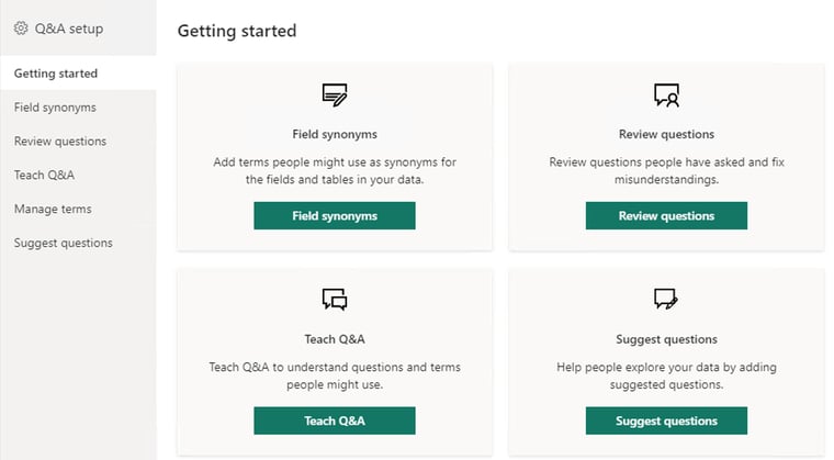
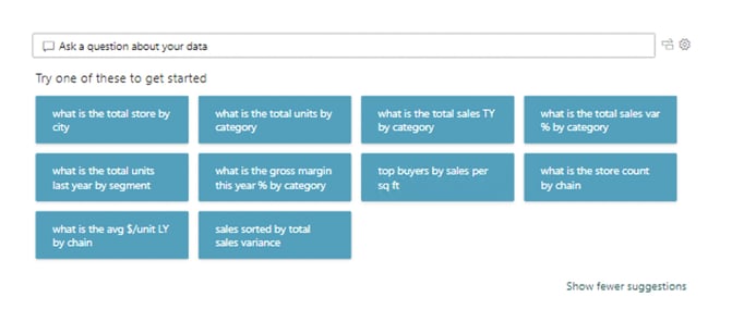 The Q&A visual works best when your data is prepared, with all fields in plain language. If your fields are not set up this way, you have the Q&A Setup option to define similar terms or synonyms. For example, one may refer to "Sales" as "Revenue" or "Country" as "Region." In other words, you can train the existing data model by adding synonyms.
AI Insights
In Power BI, you can use AI Insights to gain access to a collection of pre-trained machine learning models that enhance your data preparation efforts. You can access AI Insights in the Power Query Editor.
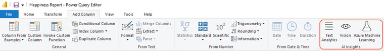
Text Analytics and Vision functions, both from Azure Cognitive Services, support the following capabilities:
Text Analytics currently supports three functions:
- Key phrases extraction: quickly identifies the main concepts in unstructured text fields.
- Language detection: evaluates arbitrary text and returns the language name and ISO identifier.
- Sentiment scoring: evaluates text fields and detects positive and negative sentiment in social media, customer reviews, and discussion forums.
Vision supports:
- Image tagging: evaluates an image or an image URL and returns tags based on the objects, living beings, and actions identified in the image.
One of the popular use cases of Text Analytics is to automatically analyze customer feedback – such as opinions in survey responses and social media conversations – and generate sentiment scores ranging from 0 (negative) to 1 (positive). This in turn allows brands to find out what makes their customers happy or frustrated, so that they can tailor products and services to satisfy their needs.
Azure Machine Learning
Azure Machine Learning enables you to consume pre-trained machine learning models hosted on your Azure portal. Using the no-code drag-and-drop interface of Azure Machine Learning designer, users can train and deploy models that then can be accessed by Power BI to make predictions.
One of the use cases is to leverage a Machine Learning model using features such as gender, age, location, hospital, primary care provider and historical wait time, and predict the average wait time for a patient for a future date. This "predicted wait time" can then be pulled into a Power BI dashboard or report from AI Insight.
Conclusion
These advanced AI features in Power BI are designed with an intuitive interface to get valuable insights into the hands of a broader user base within the organization. We hope this overview of some of our favorite functionalities will inspire more people to try them and derive meaningful intelligence from their data.
If you’re interested in better leveraging your data or have a unique data challenge to overcome, contact me at itbi@italentdigital.com.
You may also like:
How to use data to build a business case for change management
7 ways to unlock new business value during economic turbulence
Onshore, nearshore or offshore software development: which is right for you?

